Bright Coffee
(01) Logo
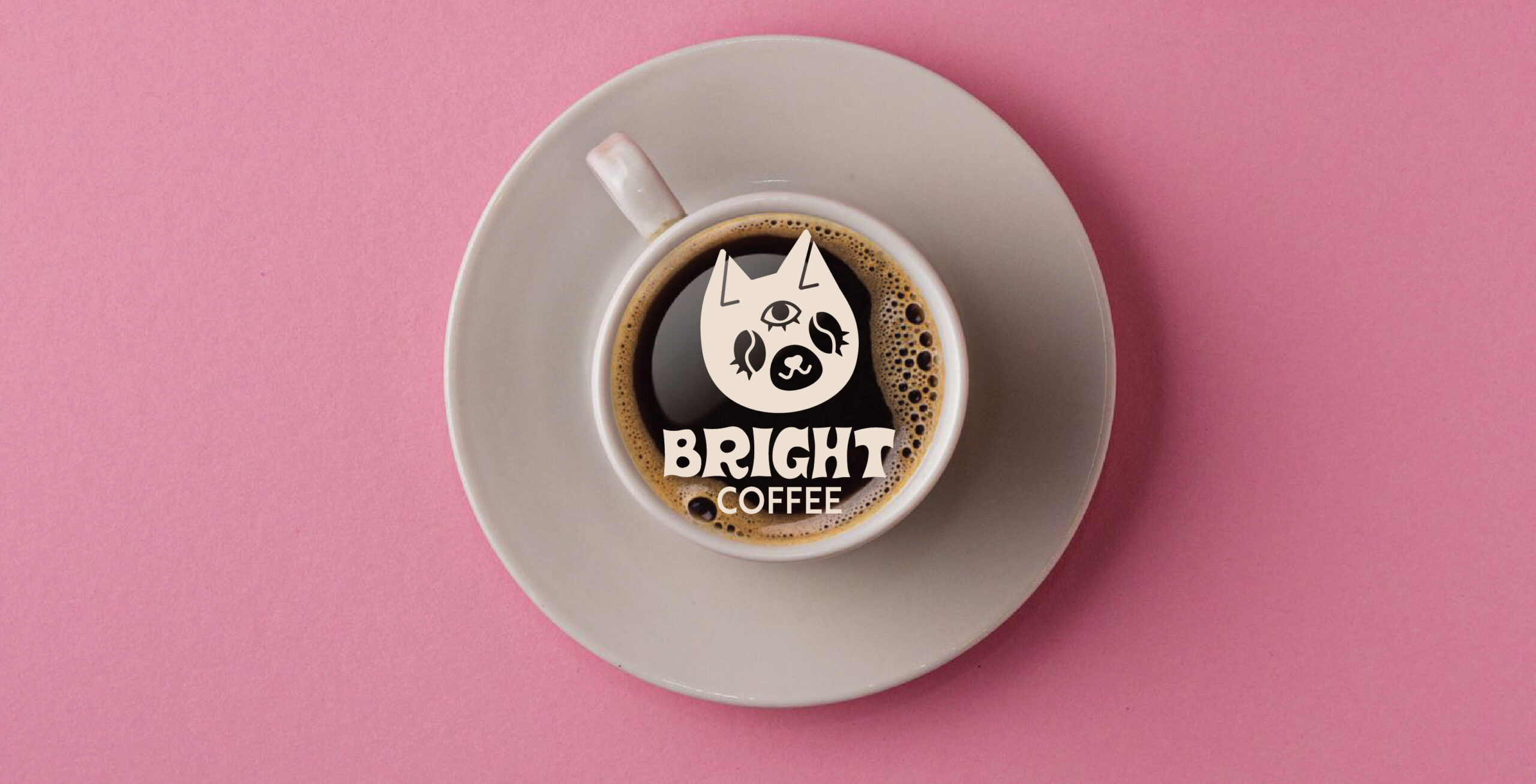
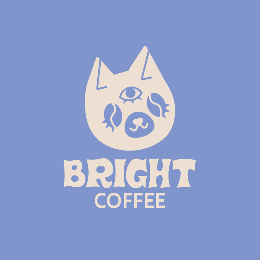
The logo was created with my own cats in mind, who tend to wake me up bright and early. The addition of the coffee bean swirls for eyes and third eye in reference to the feeling that Bright’s coffee’s strong brew offers.

(02) Color Palette
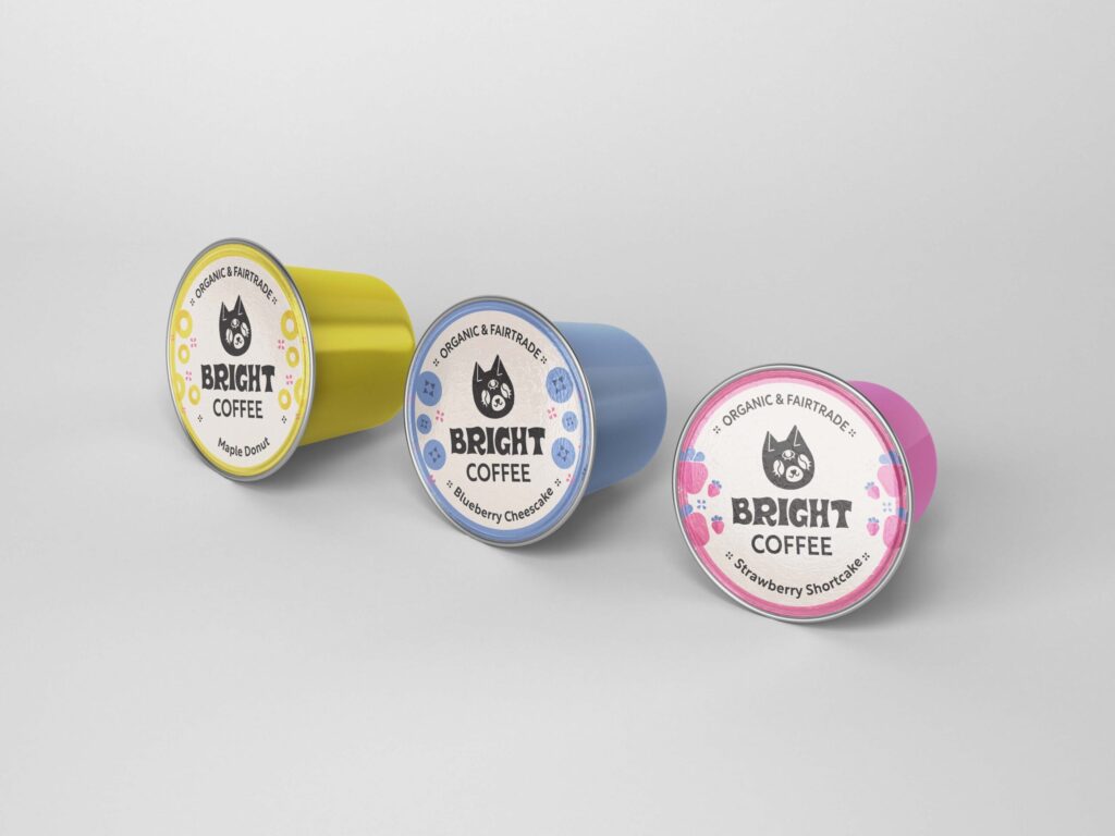
This modern palette makes use of electric tertiary colors to mimic the zingy coffee flavors and help the packaging pop from the shelf.


(03) Patterns
Brand patterns were created to create a call back to Bright’s three core coffee flavors and to give extra details to brighten one’s morning coffee routine.